
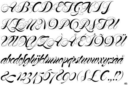
I don't usually like Script fonts. I find them too garish, over the top and often awkward to use (Brush Script & Vivaldi being two of the worst offenders). However, Mommie seems to be an exception for me.
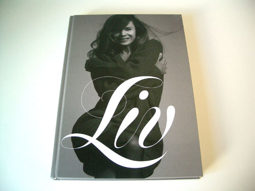
Designed by Hubert Jocham in the 1980's, this script font has slowly been gathering a following and has resulted in some excellent pieces of design. Jocham said that he was influenced by "American penmanship tradition" when designing Mommie and the fluidity and harmony between the letters clearly shows this influence. The flourishes between the characters feel really natural and create a good sense of rhythm within the face, something that I feel is a necessity for a good script font.
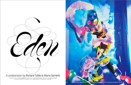
To me, Mommie comes across as a really contemporary type face; especially considering that it is almost 30 years old. You can easily draw parallels between it and some of Non-Format's more experimental, heavily stroked slab serifs. Every character manages to retain a sense of individuality whilst coming together to create a uniform style which really makes it stand out as a good type face.
No comments:
Post a Comment