
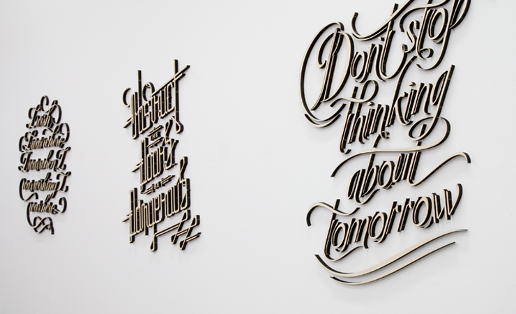
I visited the 'If You Could' exhibition in Shoreditch over the weekend. I really liked the exhibition as a whole (especially some of the video pieces) but the work that stood out the most to me was Craig Ward, Sean Freeman and Alison Carmichael's piece which is being dubbed as ‘Calligraffiti’.
I think I found the piece so engrossing because it had a perfect mix of typography and craft elements, the format that they realised the concept through really accentuated it's imapct, I admired this direction and would be keen to involve it within my own work.
The compositions of these pieces were obviously very well thought out, and the 3D nature of the letter-forms was impressive up close. The different styles worked well for the different quotes and managed to set them apart from each other. Once again, the fluidity within the type was a highlight, it really seemed to gel together within the sentence and create a sense of rhythm. The flourishes were used really successfully to create shape and structure, holding together lines and placing extra emphasis on some characters and detracting it from others.
No comments:
Post a Comment